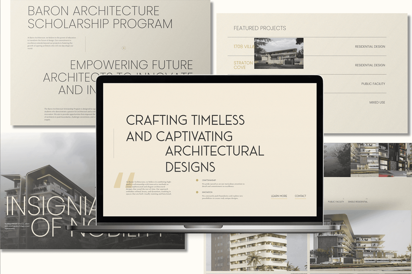
Project Overview
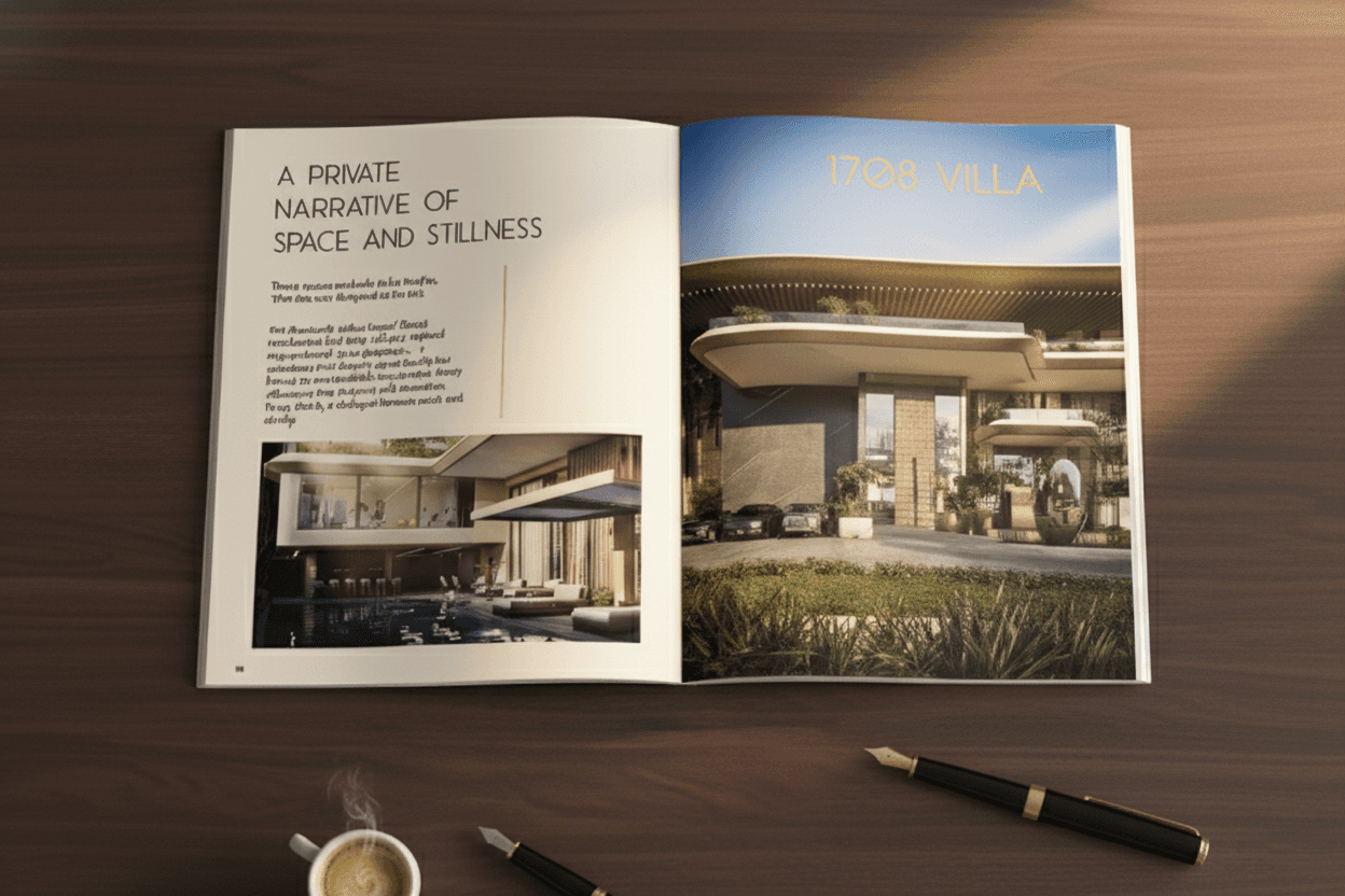
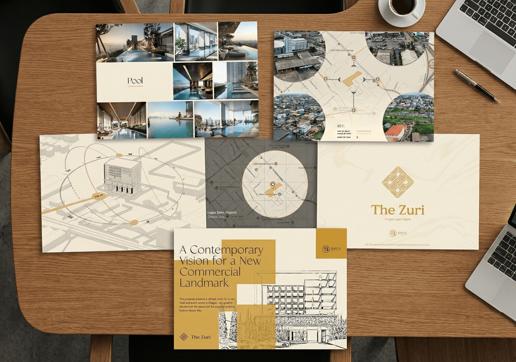
Baron Architecture needed a clearer brand system and digital presence to support its growth. I developed the visual identity, website direction, communication framework, and supporting content workflows, turning a loosely defined brand into a cohesive platform for growth and client communication.
Baron Architecture / Film & motion
Process 01
Discovery & Strategy
The refresh began with a discovery session , where the client shared design preferences, inspirations, and their vision for the brand. Together, we defined their target audience and brand personality. Key conclusions:
Visual Language : Expressive, luxurious, functional. Bold and artistic, but never loud or flashy.
Audience : Refined, cultured, discerning, and quality-focused. Appreciates subtle luxury and understated excellence.
Brand Essence : Minimalist with expressive details, warm lighting, subtle textures, and an almost cinematic feel.
This session established the foundation for every creative decision that followed .
Process 02
Visual Identity
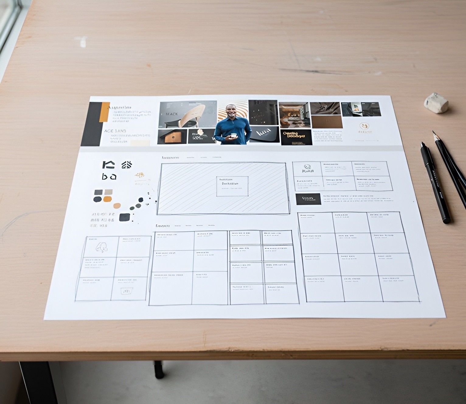
Using the existing logo as an anchor, I explored Baron Architecture’s office, architectural projects, and materials to uncover the brand’s visual DNA. Key elements established included:
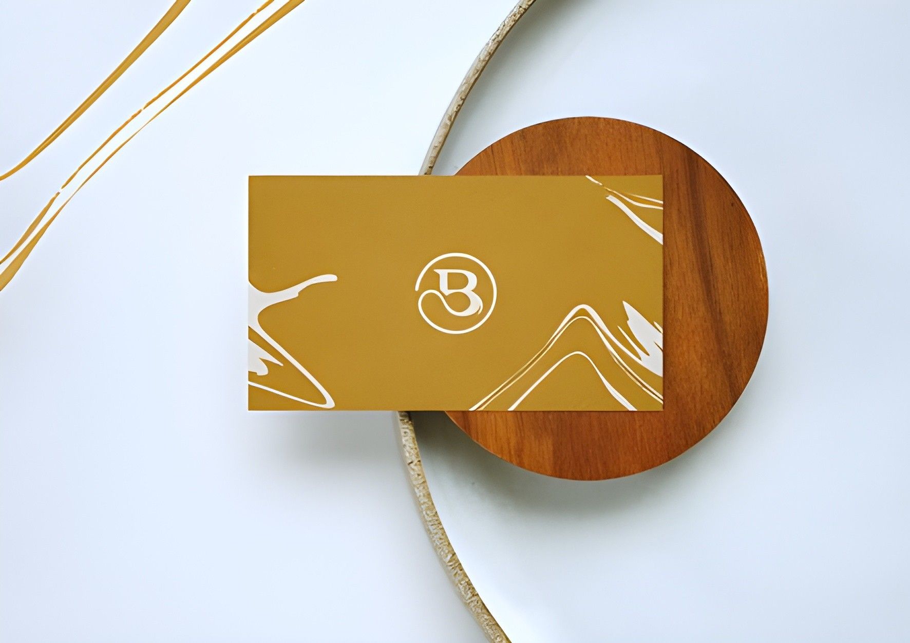
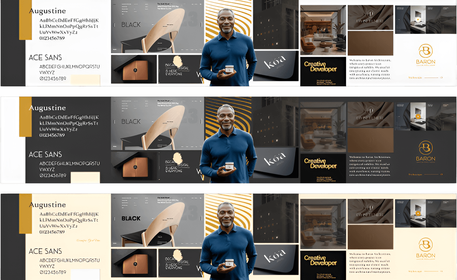
Colors : Custom gold, cream, off-white (#F8F8F8), and grey (#333333)
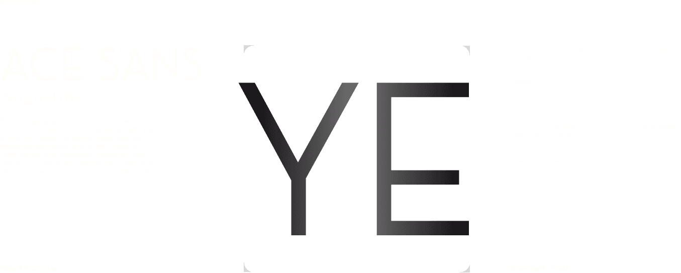
Typography : Originally Ace Sans (titles), Augustine (body), Great Vibe (accent); later refined to Classico (headers), Nexa (body), retaining Great Vibe (accent)
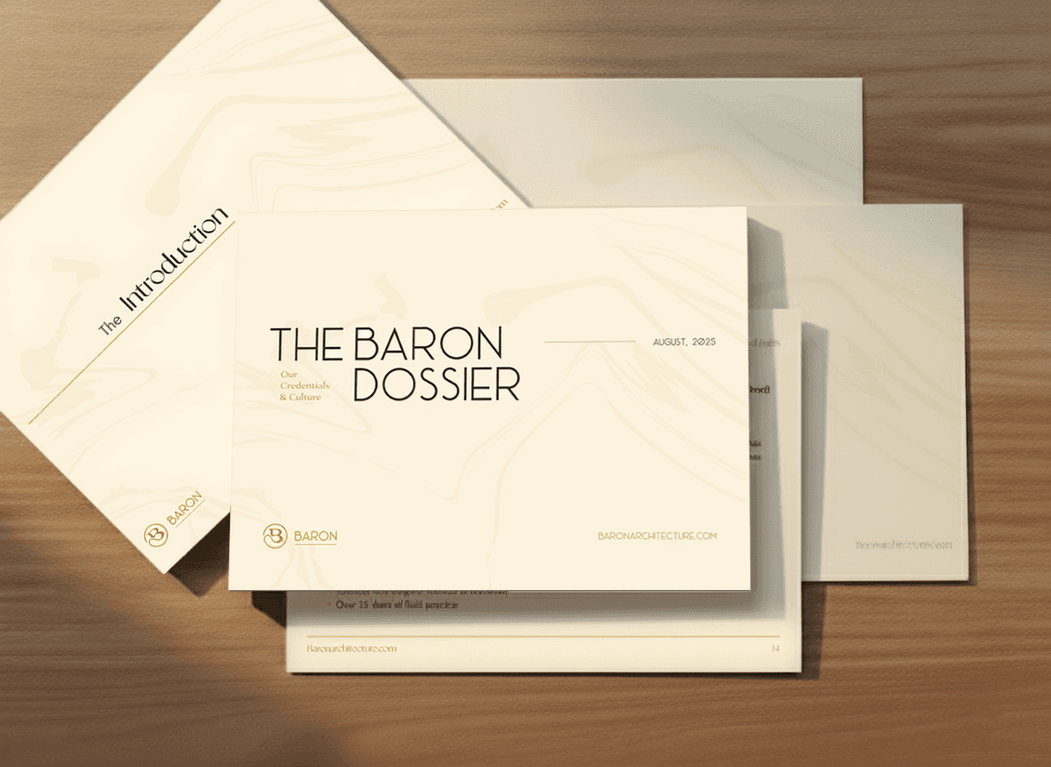
Textures & Lighting : Subtle wavy textures, warm and atmospheric lighting, minimal yet expressive composition
The resulting visual identity communicates the firm’s sophistication, artistry, and functional elegance while resonating with their target audience.
Process 03
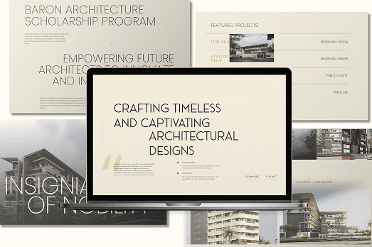
With the brand identity in place, I led the website design :
Structured the content around the refreshed visual identity.
Ensured every element — typography, color, imagery, and interaction — reflected the expressive luxury aesthetic .
Created a cohesive, intuitive layout that highlights projects, skills, and philosophy, while maintaining the brand’s understated sophistication.
Process 04
Brand Application & Management
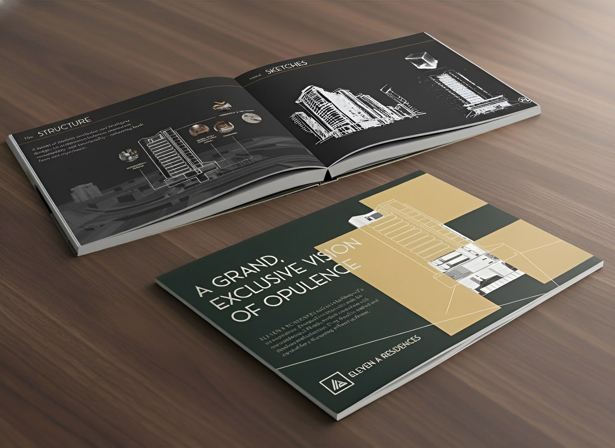
Beyond the website, the brand refresh extended across all touchpoints :
Social Media : Custom captions, visual content, and cohesive presentation.
Photography & Videography : Custom LUTs and consistent color grading to match brand aesthetics.
Ongoing Management : Ensuring brand consistency across campaigns, digital platforms, and internal communications.
Every asset now reflects Baron Architecture’s identity, subtle, bold, functional, and luxurious.
The outcome
Transformed a loosely defined brand into a cohesive, expressive, and luxury-focused identity .
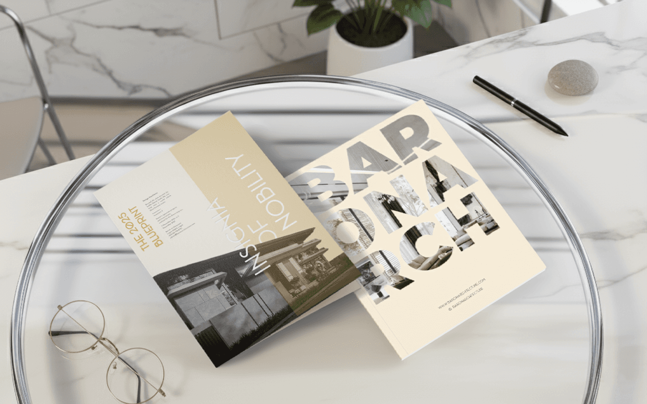
Provided a strategic, multi-platform visual system , including digital, print, and environmental touchpoints.
Created an identity that resonates with the firm’s high-end, discerning audience , elevating their perception and professional presence.
Social media following grew from 9K to 12K , with a healthy engagement rate .
Brand visuals and content have received praise from followers and industry peers .
Social media presence is now generating a consistent stream of quality leads , contributing to business growth.