Project Overview
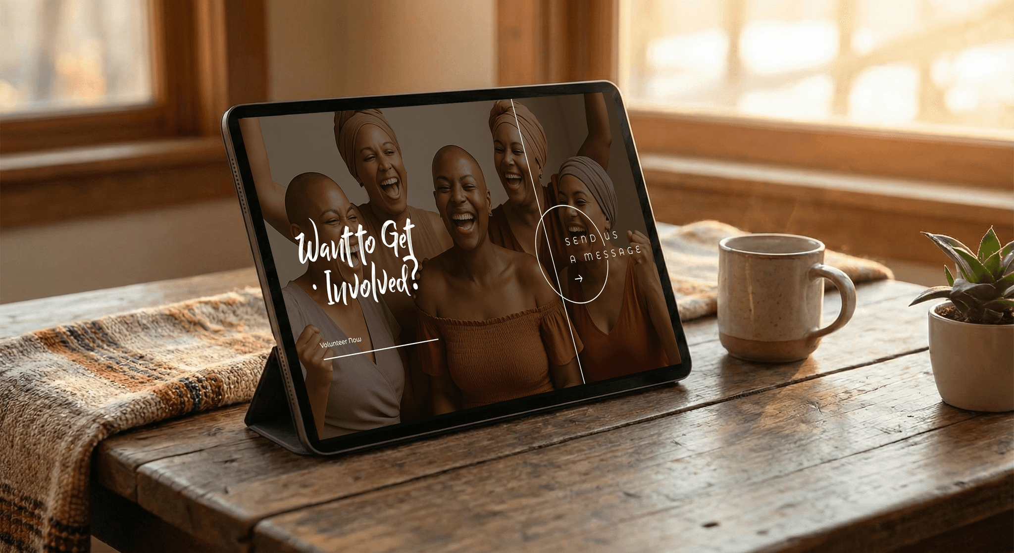
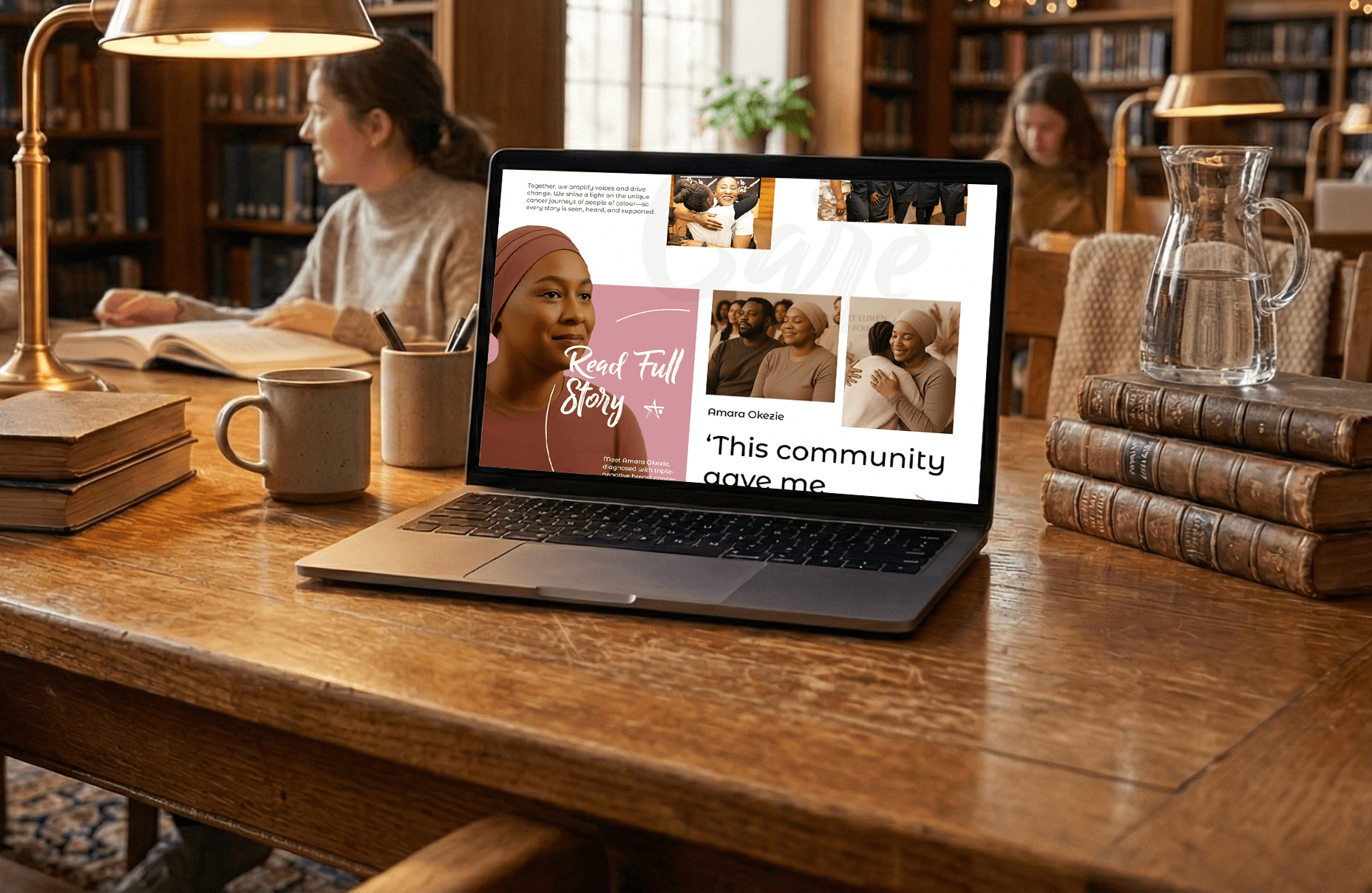
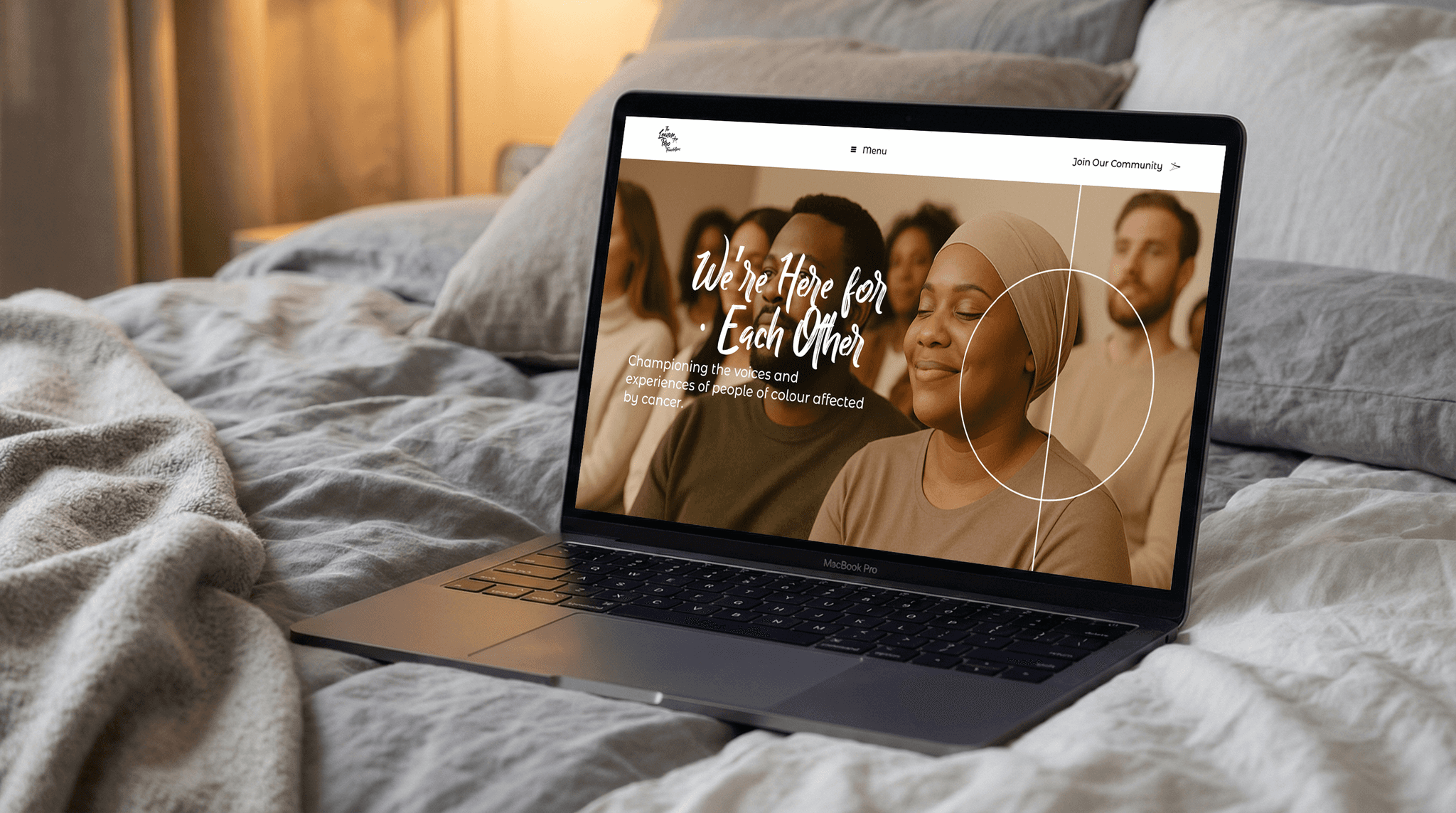
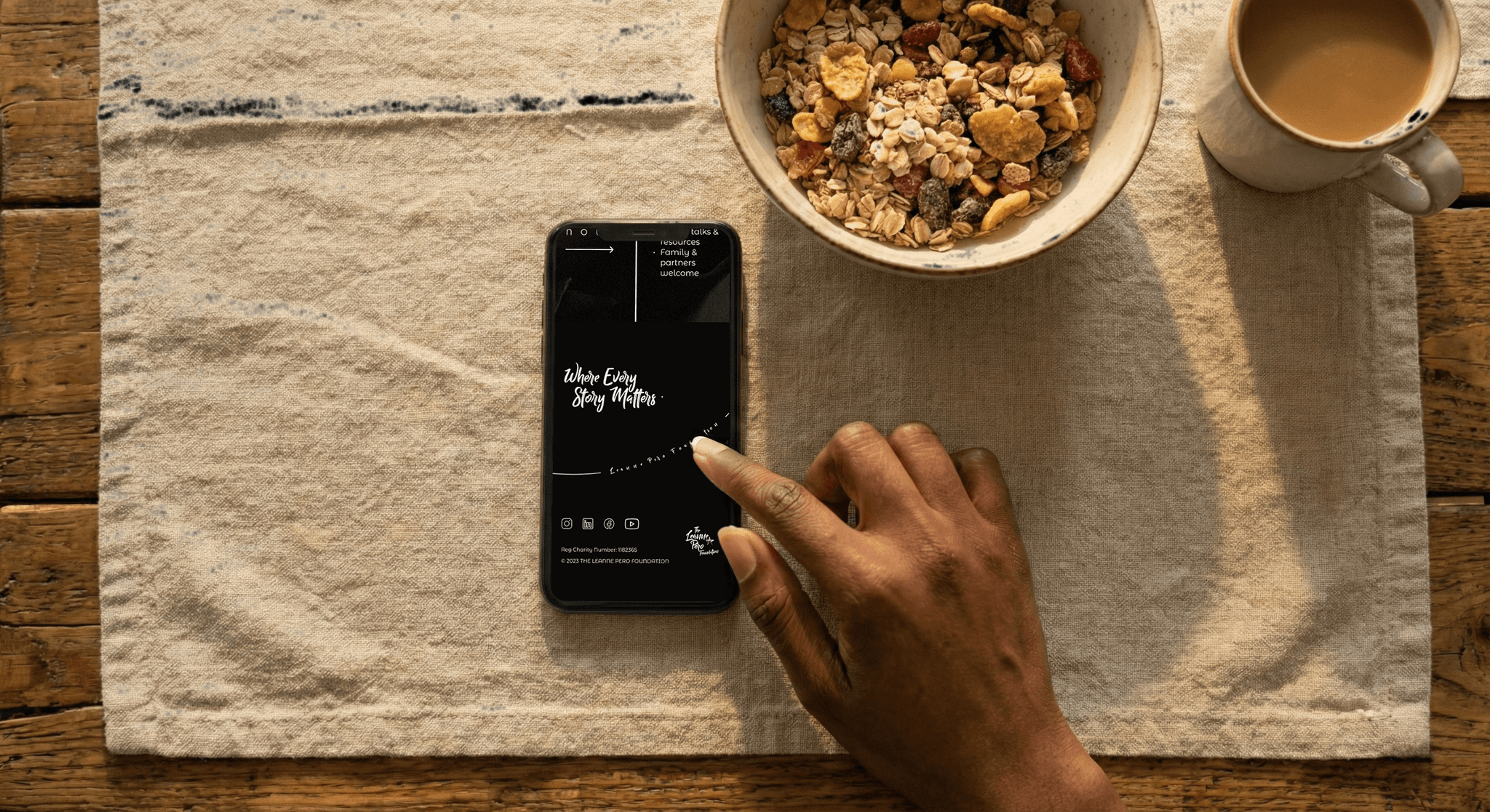
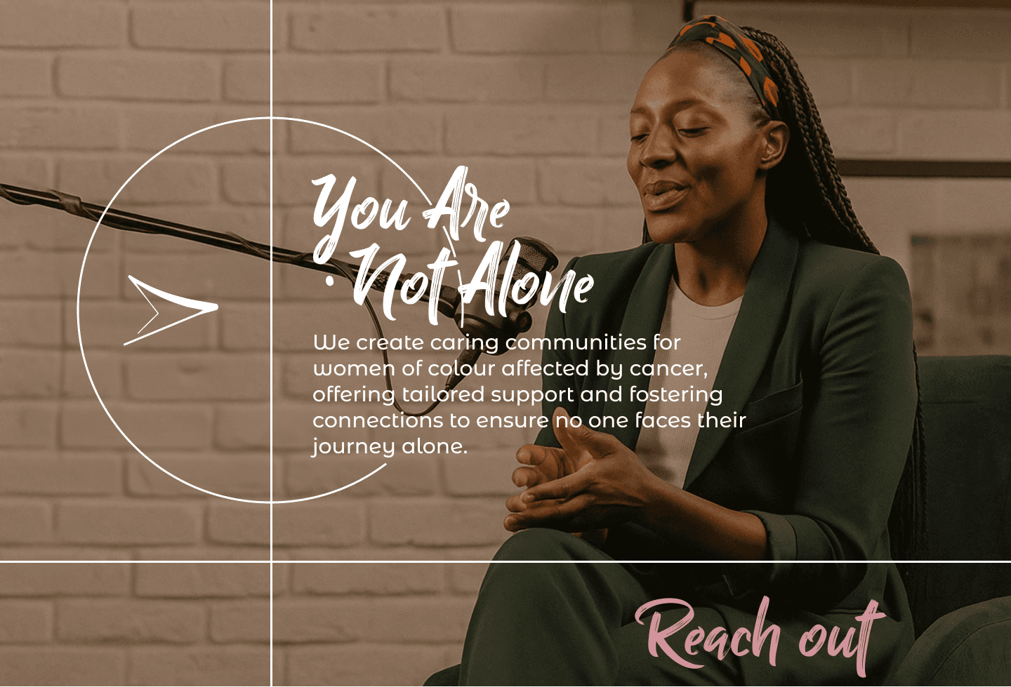
The Leanne Pero Foundation stands at the intersection of advocacy, healing, and culture, supporting women of colour through education, community, and shared experience. Our task was to translate this mission into a digital identity that feels bold in its message, authentic in its voice, and welcoming in its presence. This involved designing the brand’s visual direction, crafting stylescapes, defining tone of voice, and prototyping a website that reflects emotional clarity, cultural resonance, and modern UX thinking.
The Leanne Pero Foundation / Film & motion
Process 01
Deep-dive session exploring the foundation’s purpose, audience, vision, emotional cues, and cultural nuances. Defined brand attributes: Bold, Authentic, Welcoming.
Process 02
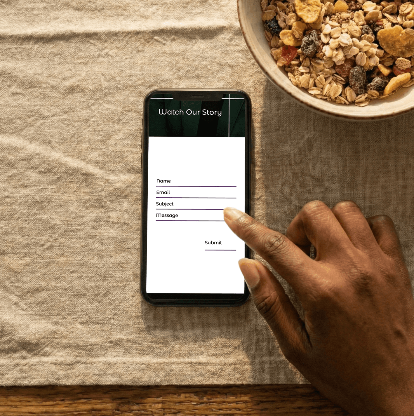
Created the brand principles, positioning map, core message, tone of voice, content pillars, and narrative system. Mapped UX requirements for Homepage, About, Platforms, Events, and Contact.
Process 03
Produced an evolving stylescape expressing colour psychology, type hierarchy, photography direction, emotional tone, and layout structure. Refined aesthetics based on soft lighting, warm skin tones, community energy, supportive environments, and clean minimalism .
Process 04
Constructed wireframes for all major pages. Designed imagery through guided AI generation to match brand tone and cultural authenticity. Developed a grid system and component structure ready for high-fidelity design and development.
The outcome
Our work reshaped how the foundation presents itself online—elevating its visibility, strengthening trust, and creating a unified platform to support its growing community.
The result is a brand that feels human-first and future-ready, rooted in lived truth while staying visually modern and empowering.