
Project Overview
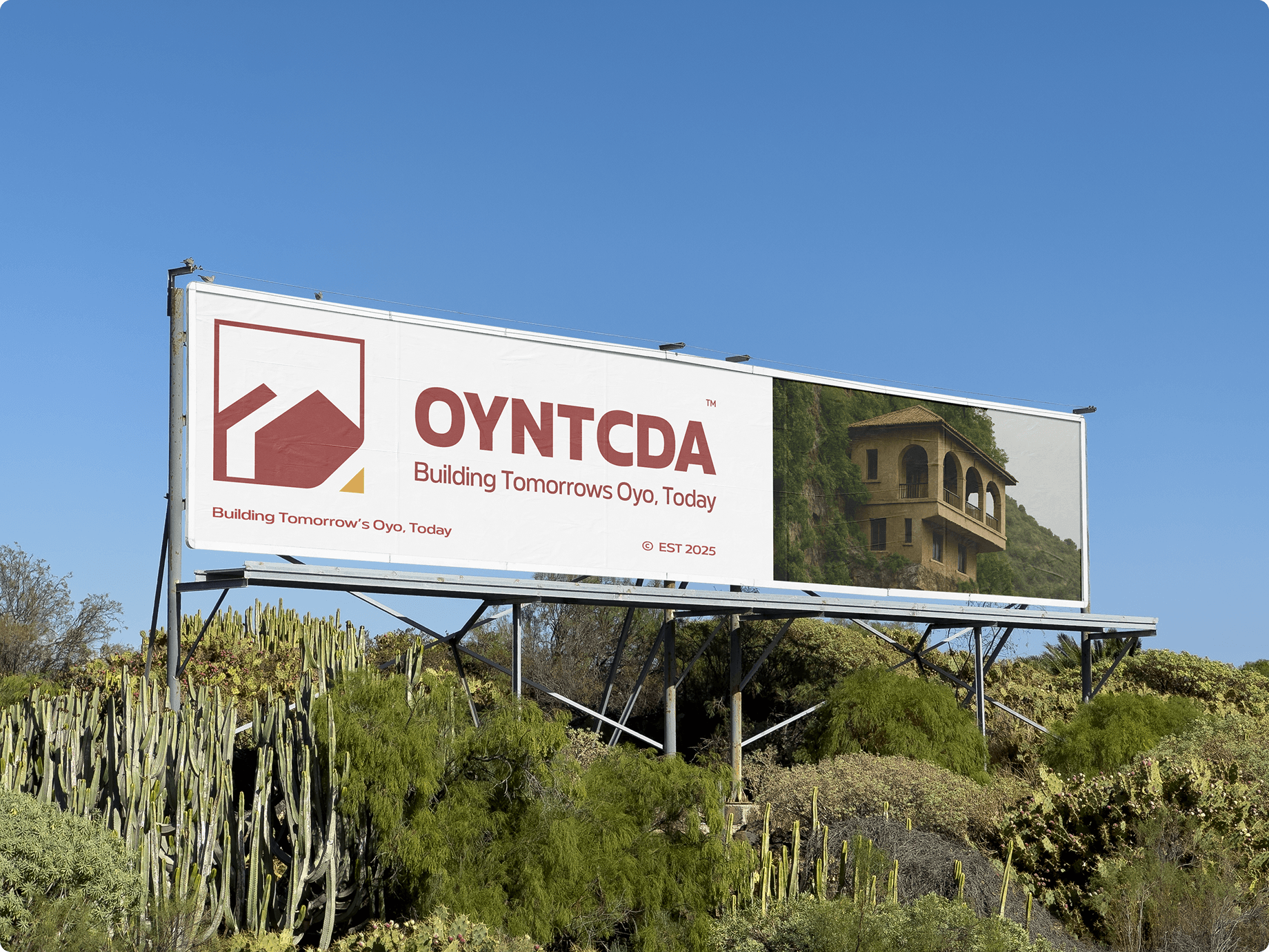
The Oyo New Towns Development & Communication Authority (OYNTCDA) needed a unified, modern brand system to reflect its mission of shaping future-ready communities across Oyo State. I led the full brand identity transformation, from strategic foundations to complete visual execution, crafting a system that balances cultural heritage with contemporary clarity. The result is a Modern, Bold, Authentic identity built around a negative-space architectural icon inspired by community, structure, and connection. The visual language includes a refined colour palette rooted in Oyo’s landscape, a distinct typographic system centred on Meutas, bespoke gradients and patterns, and a consistent brand voice that communicates confidence, progress, and human-centred development. The project culminated in a complete brand guideline and rollout assets, providing OYNTCDA with a scalable, future-proof identity ready for government communication, public engagement, infrastructure storytelling, and digital presence.
OYNTCDA / Film & motion
Process 01
We began by establishing a clear understanding of OYNTCDA’s purpose, audience, and long-term vision. Through conversations and analysis, we clarified what the brand must represent: modern development, bold progress, and authentic connection to Oyo’s heritage . This phase gave us the foundation for all strategic and visual decisions.
N ext, we defined how the brand should speak and what it should consistently communicate. This included:
Core messaging pillars (“Building Tomorrow’s Oyo.” “Progress with Purpose.” etc.)
A refined mission statement
A clarified tone, Modern, Bold, Authentic
A concise positional statement summarising the brand’s role in shaping new communities
This step ensured the identity wasn’t just visual, but deeply narrative.
Process 02
With the brand direction set, we moved into shaping its visual world. This involved:
Establishing the three brand descriptors: Modern , Bold , Authentic
Defining how these qualities should appear in behaviour, visuals, and communication
Building a cohesive design language aligned with Oyo State context
This created the foundation for a system that feels both progressive and rooted. We selected Meutas as the primary typeface due to its clean sans-serif structure paired with subtle curves and character. It aligns with the brand by:
Mirroring the shapes and rhythms of the logo
Feeling modern yet human
Remaining distinct without being distracting
A type-scaling and grid system was also developed using the golden ratio for structure and multiples of 8 for spacing.
Process 03
We crafted a palette inspired by Oyo State’s colours but refined for a modern identity. The palette includes:
Clay Red (primary)
Sunshine Gold
Deep Elm Green
Pure Linen
Nightfall Black
Gradients were built from these colours to allow dynamic expressions. We also defined best-use combinations and rules for applying the palette respectfully.
We shaped the brand’s textural world through:
A geometric, bold, and traditional light/dark pattern system
Cinematic, emotion-led imagery that uses natural tones and soft, clear light
These elements support the brand’s bold yet human visual identity. We explored multiple logo concepts, refined them, and aligned them with the agency’s values. The selected mark was built around:
Three buildings formed by negative space , symbolising community, closeness, and sustainable growth
A yellow wedge at the base representing roads, pathways, and development
A clean, 24×24 grid, 2-unit strokes, and clear spacing rules for precision and scalability
This process balanced storytelling with strong, functional design.
Process 04
Finally, we brought all components together into a structured identity system, including:
Colour rules
Logo usage and clear-space guides
Typography rules
Pattern and imagery direction
Vehicle branding recommendations
This ensures consistency across all touchpoints, present and future.
The process was not about assembling visuals, it was about building a cohesive identity system rooted in purpose. Modern in execution. Bold in expression. Authentic in voice.
Every element ties back to OYNTCDA’s mission: creating connected, sustainable communities for a brighter Oyo.
The outcome
The redesigned identity and communication system gave OYNTCDA a clearer, more professional presence, helping them present their vision with confidence and structure. Since the project, the brand has continued gaining investor interest, attracting support, and moving forward with their development plans. Their communication is now more organised, visually aligned, and easier for stakeholders to engage with, contributing to the smooth momentum they’re experiencing today.


