Project Overview
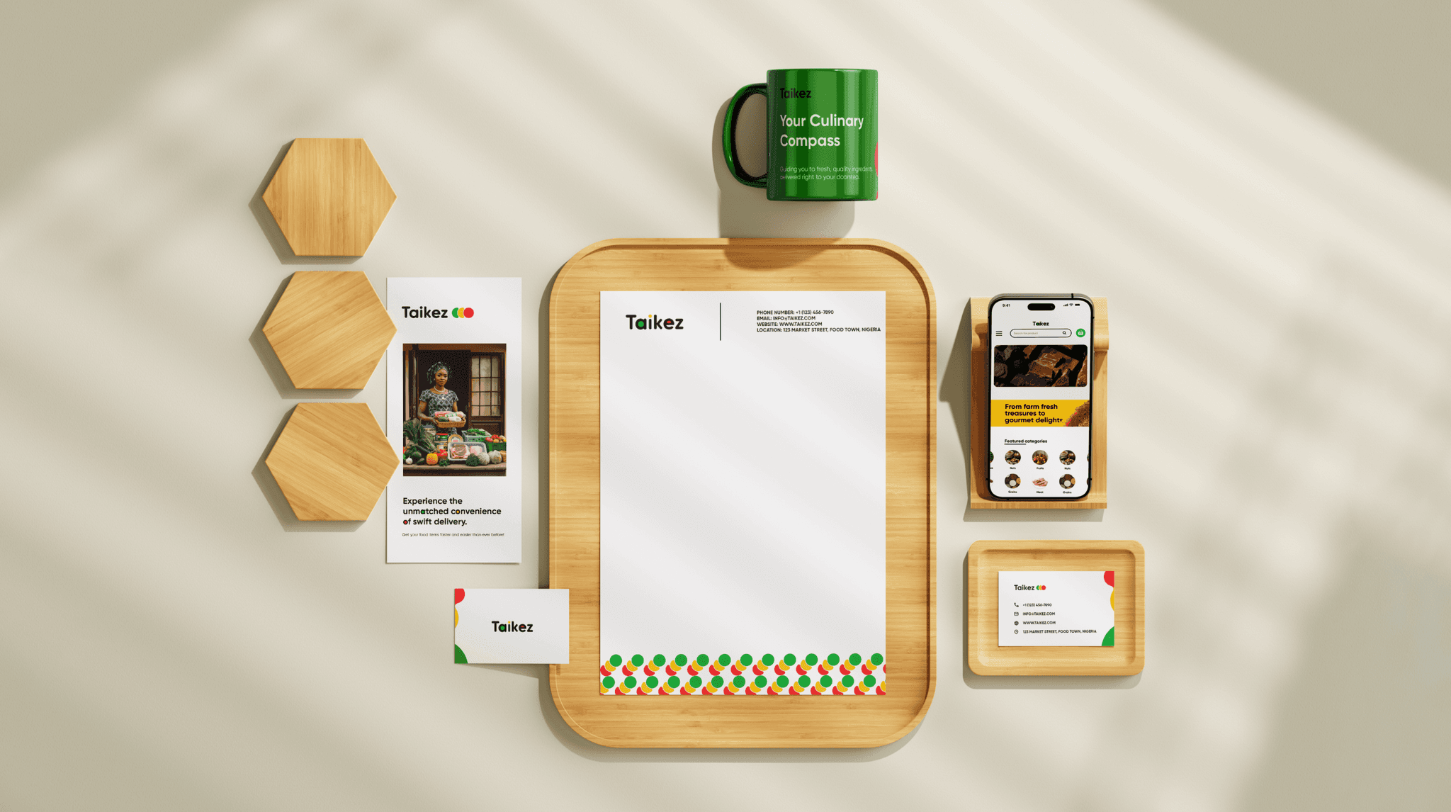
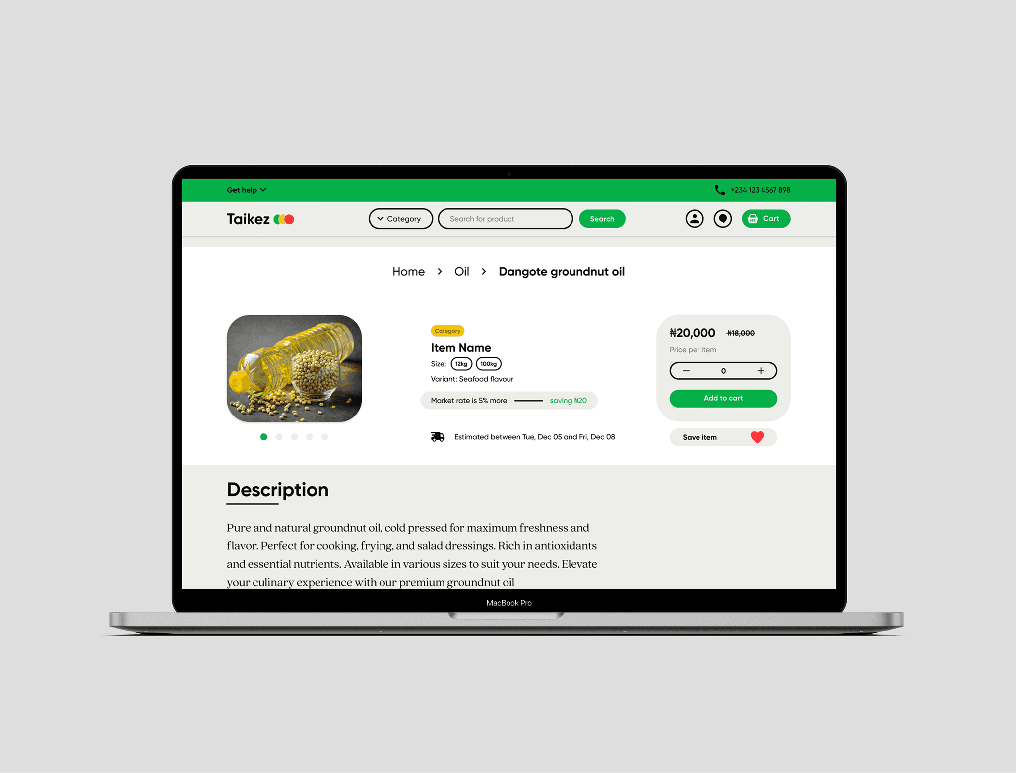
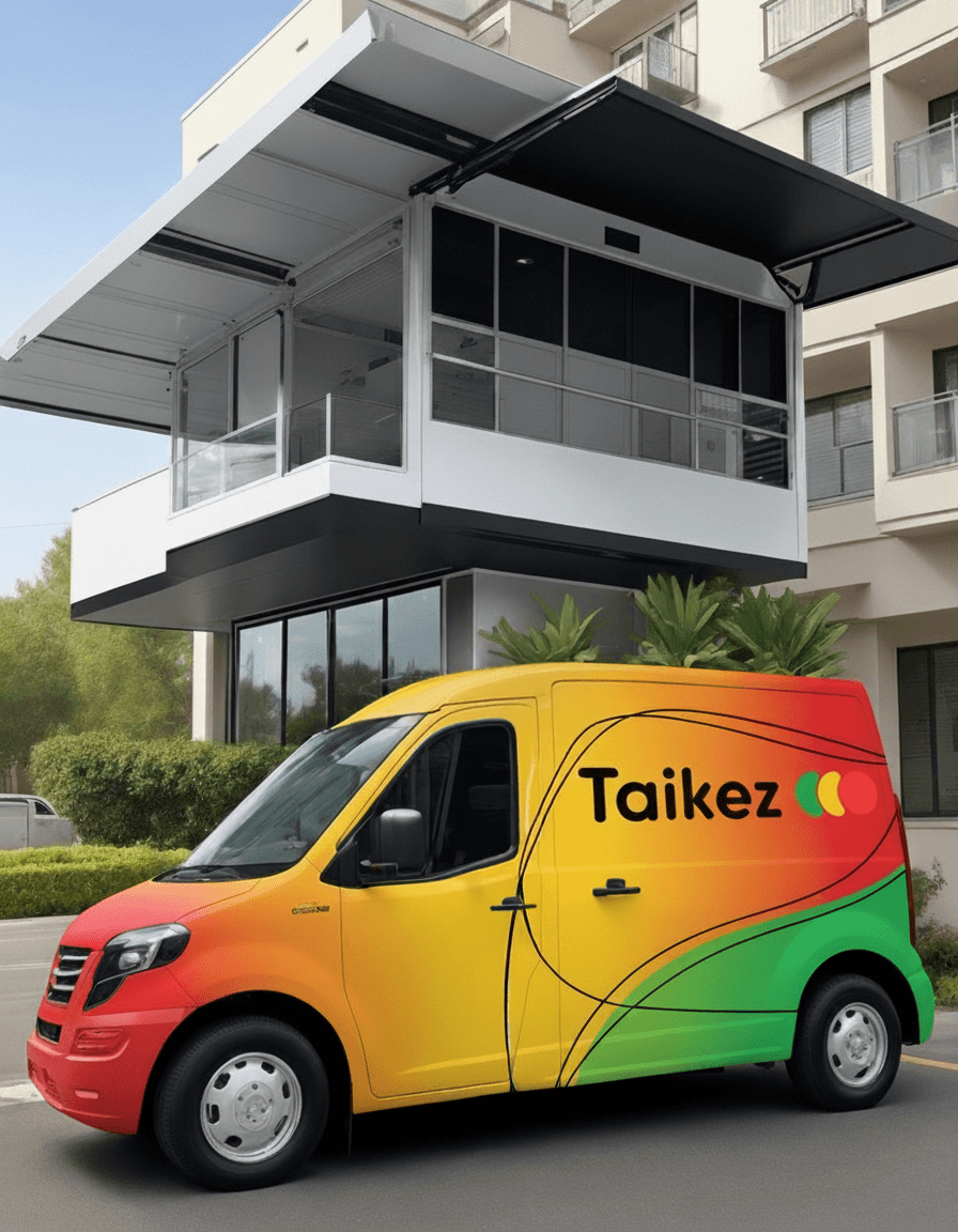
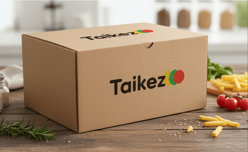
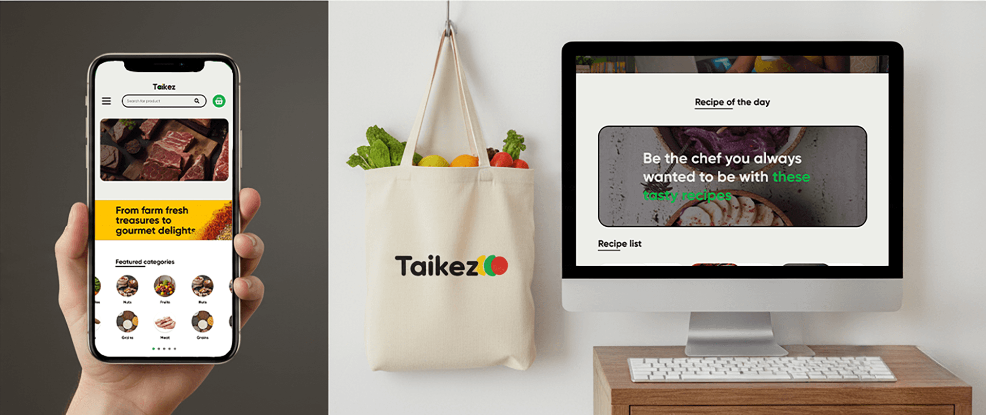
TAIKEZ approached us with a clear mission: to simplify ingredient shopping with a brand that feels refined, bold, and vibrant. We developed a complete brand identity system that began with strategic discovery sessions and evolved into polished visual directions, a confident logo design, and a modern, user-friendly website experience. The result is a brand that communicates clarity, trust, and freshness, delivered through a scalable visual identity and a digital presence tailored for real-world use.
TAIKEZ / Film & motion
Process 01
We began with a structured discovery session to understand TAIKEZ’s business model, values, audience, and goals. This phase revealed the emotional tone and personality the brand needed to communicate: refined, bold, and vibrant.
Process 02
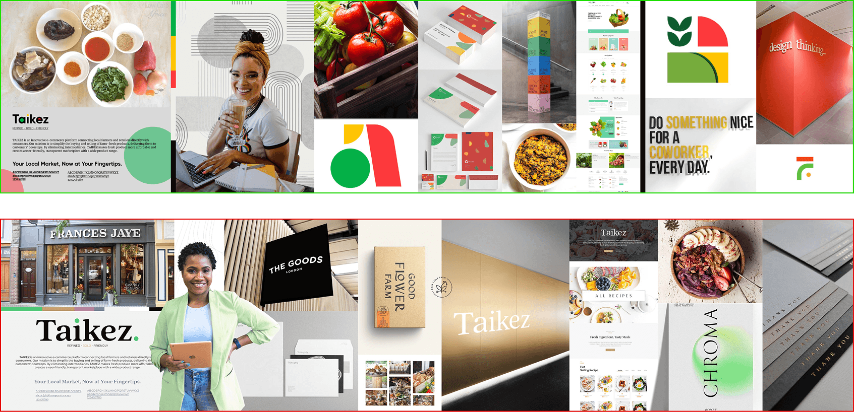
Using our research, we developed the brand strategy, including core messaging and visual attributes. We then created two stylescapes that translated these ideas into visual worlds, allowing the team to confidently choose the direction that best represented their vision.
Process 03
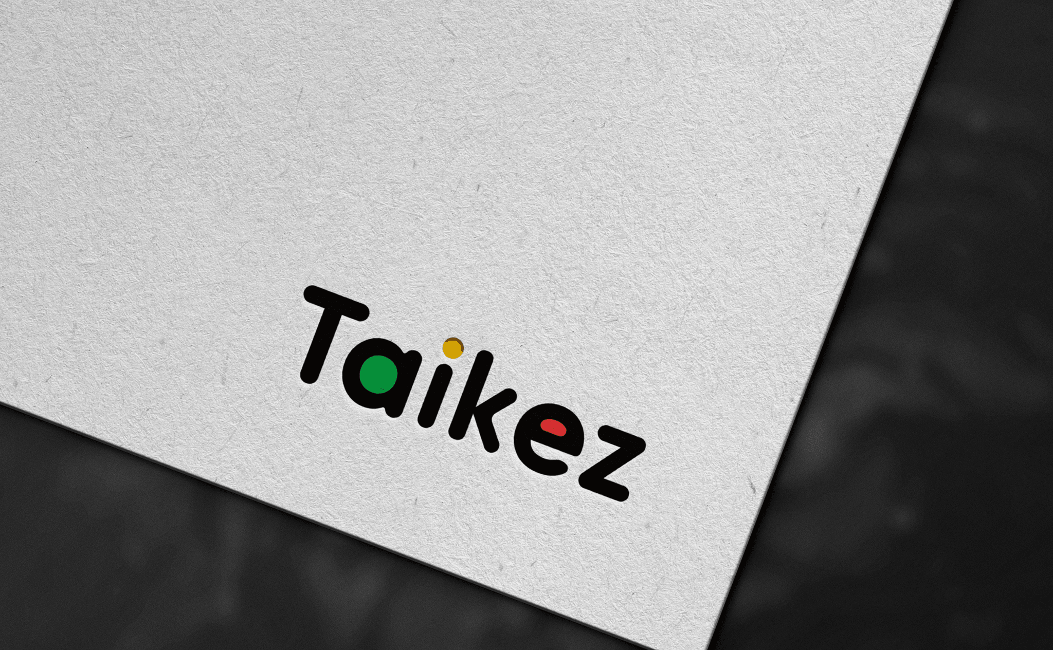
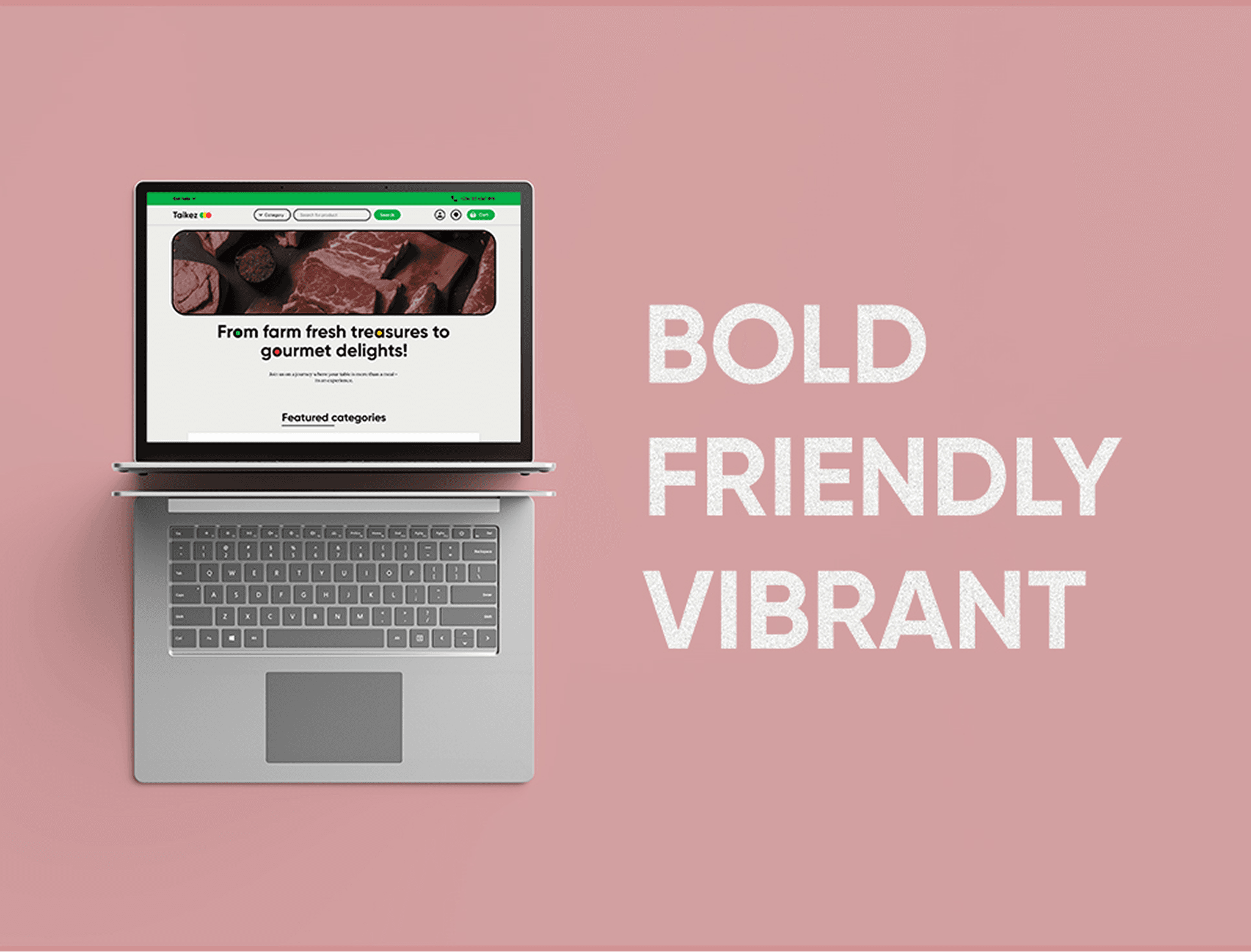
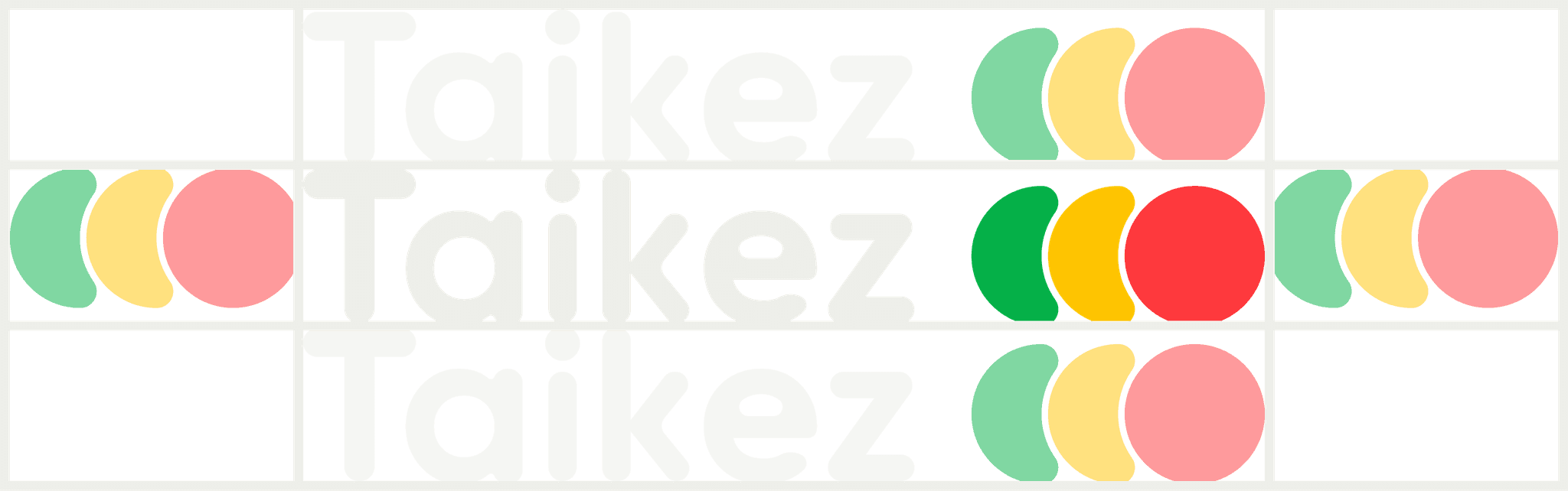
After finalizing the visual world, we designed three logo options rooted in the selected direction. The client reviewed the concepts over one week and selected their preferred mark without any modifications. We then extended the visual identity into the website design, creating a polished and intuitive UI system.
Process 04
We refined the components, built a responsive grid and layout system, and prepared all brand assets. For the website, we ensured usability, SEO readiness, and CMS flexibility, delivering a complete identity and digital foundation that TAIKEZ can scale with confidence.
The outcome
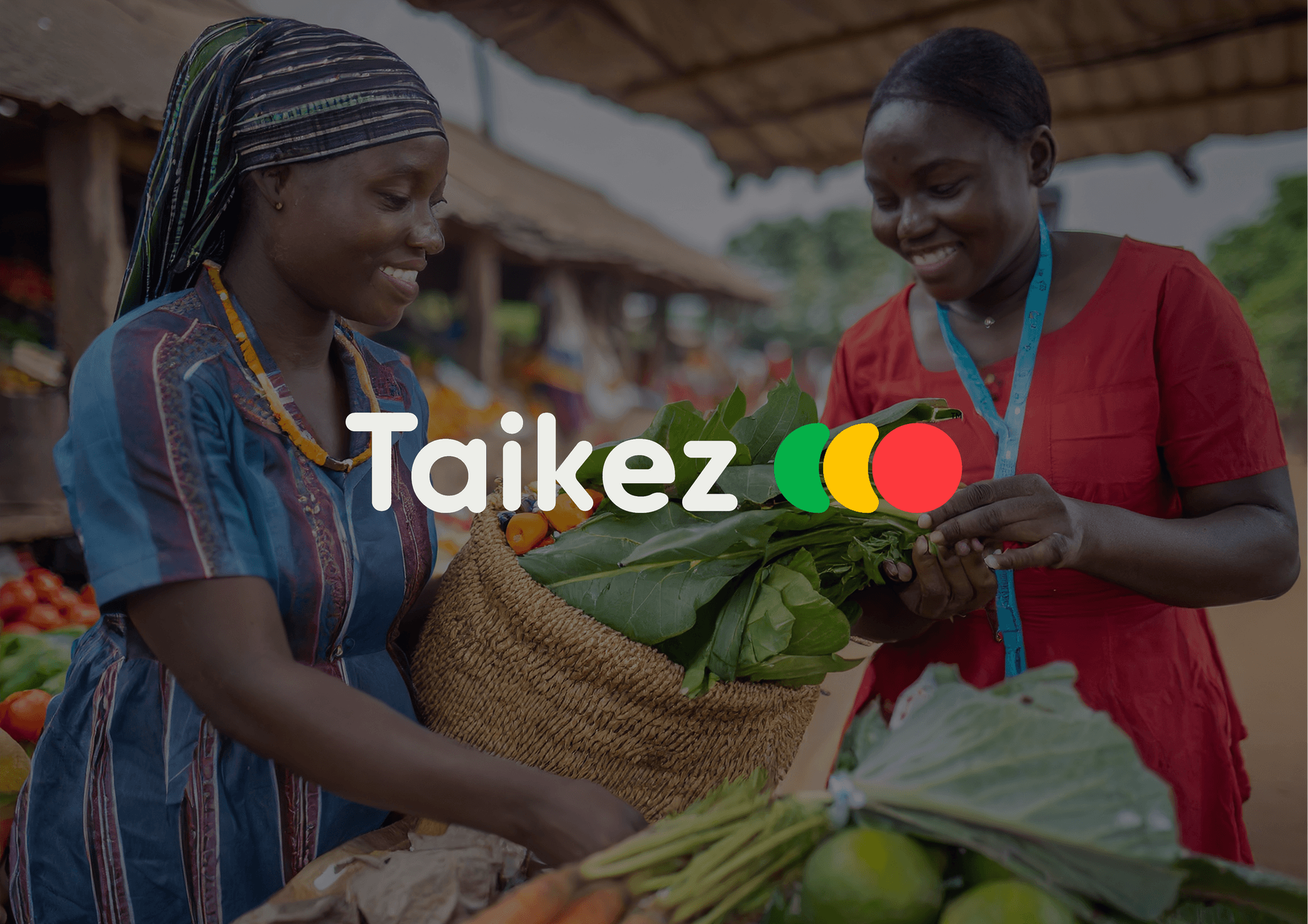
We helped TAIKEZ clarify its purpose, build a bold and refined brand identity, create a new logo, and design a seamless website experience that makes food shopping easier for customers and more profitable for farmers and vendors.